When Boston’s public schools began replacing Mercator projection maps last month, the news came as a bit of a shock. Gerardus Mercator’s geographic diagram continues to have nautical usage and is the basis for most digitalized cartographic imagery, including Google Maps. But in an age of digital precision inherent map making distortions have become a hot-button issue. Accurately representing a three-dimensional image on a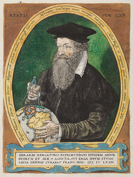 two-dimensional surface remains a difficult task.
Mercator’s unique geography projection has been a significant reference source since the Flemish cartographer first published his map in 1569. The conformal representation effectively uses east-west parallels and north-south meridians, which form rectangular grids by means of intersecting right angles. Using the true North Pole as a bearing, navigators can plot a consistent path across the Earth according to well-calculated travel routes based on the Mercator map. As references go, the cylindrical projection chart has proved to be an effective way of storing information, looking at spatial patterns and communicating an idea about the planet’s topography. But there are setbacks, namely distortion of scale.
Looking at a conventional Mercator map, Greenland is roughly the same size of Africa. But according to mapsofworld.com, Greenland occupies roughly 836,109 square miles, while the great continent has been measured at approximately 11,730,000 sq. mi. Similar mapping inaccuracies occur in other areas of Mercator’s creation, especially at each pole, where land masses often tend to be larger than reality dictates. French mathematician Carl Gauss addressed the inherent problems of accuracy and stretching within curvature by way of his Gaussian theory. Even using formulas, creating three dimensions on a two-dimensional surface is difficult.
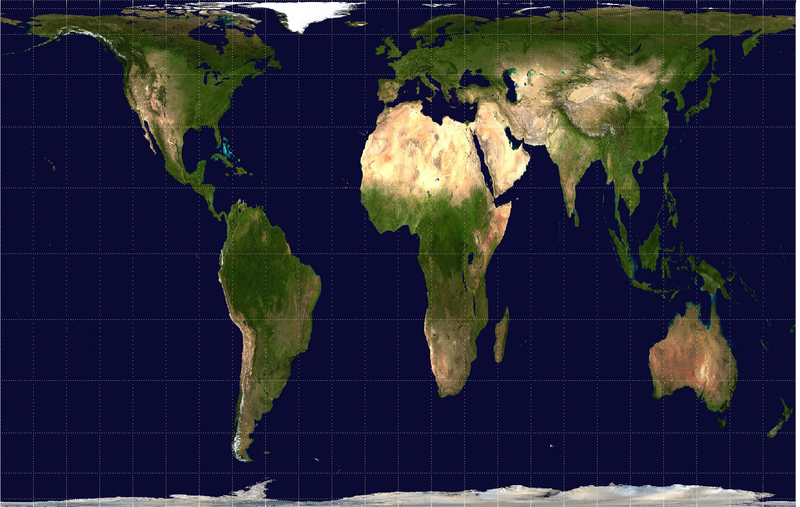 In Boston, which has a rich maritime history, public school students have begun to use the Gall-Peters map. Invented in 1855, the Gall-Peters projection is a proportionate rendering of the world where the size ratio of continents is more realistically portrayed. But if you look at the GP map, things just do not seem right. For instance, South America and Africa are elongated and Australia appears slightly squeezed like an accordion. Along the top of the map, areas are compressed. If you are going to swap the long standing Mercator perspective for something else, perhaps a better choice is the Winkle Tripel projection map. The unusual spelling can be attributed to the mathematical formula employed by its creator, Oswald Winkel. Realizing Gauss’s theory, instead of eliminating distortions, Winkle sought to minimize detracting features. The National Geographic Society adopted the Winkel Tripel as the standard for projection maps of the world. As far as accuracy, the Winkel is the current standard bearer for world maps.
Video: ‘Boston Public Schools Dilemma’ – TheGeoScholar/YouTube
Photo(s): Portrait of Gerardus Mercator 1574 – Gravure ancienne/public domain/Creative Commons; Gall-Peters Map Projection – Louis Waweru/Creative Commons; usage of photos/images does not constitute endorsement by the authors and sources.
Paul Wolfle has a B.A. from Hofstra University; and an ARM (Risk Management) insurance certification.
